
A family home by Workaday Design emerges through a clever mix of neutrals and saturated color.
Photos by Meagan Larsen
When Rebecca Van Sickle and Fergus Caldicott moved into a historic home in Northwest Portland in October 2014, they knew that it would need some major adjustments. Previous owners had made some cosmetic updates throughout the years, but no one had changed the awkward transitions between spaces, added to the number of bathrooms (two at the time) or grappled with the problem of doors hitting other doors. Plus, there was the matter of color — how to use it well to make the home feel modern while honoring its history.
“Overall, the flow felt off,” says Van Sickle. “We lived with some of the spaces longer than we expected.”
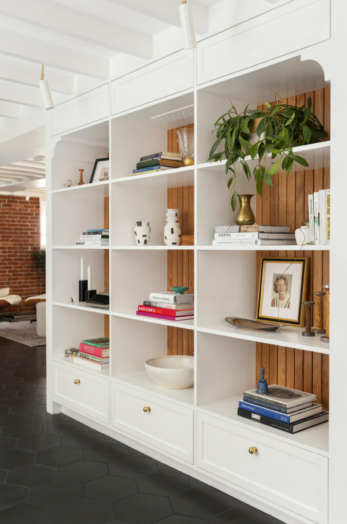
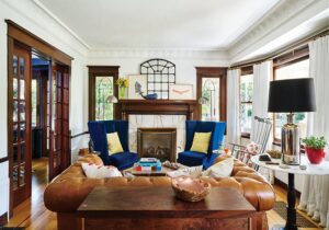
Large families demand a different level of functionality, but making it happen can be a cumbersome task. So the couple embarked on a multiyear, multiphase project with designer Lara White of Workaday Design to bring the historic property into the present while keeping the charms of yesteryear. And what charms there were: stained glass, south-facing windows, high ceilings, architectural details and brass door hinges that had “XOXO” stamped in them.
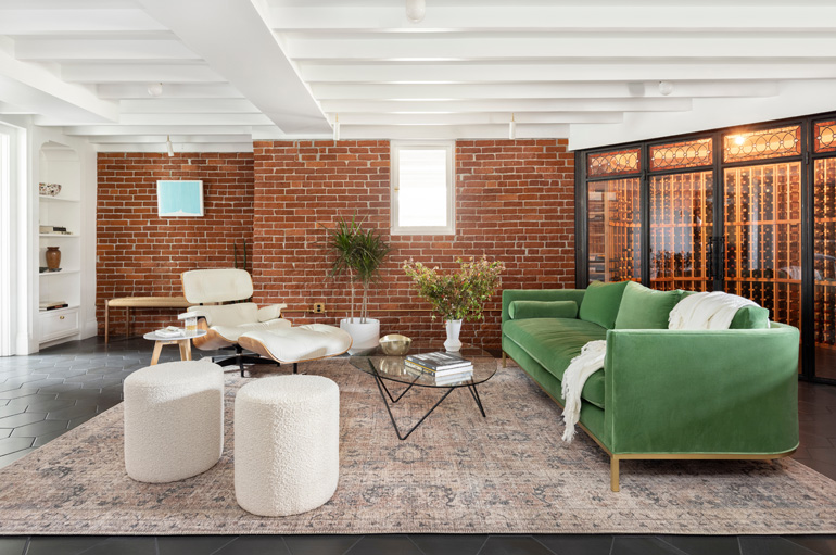
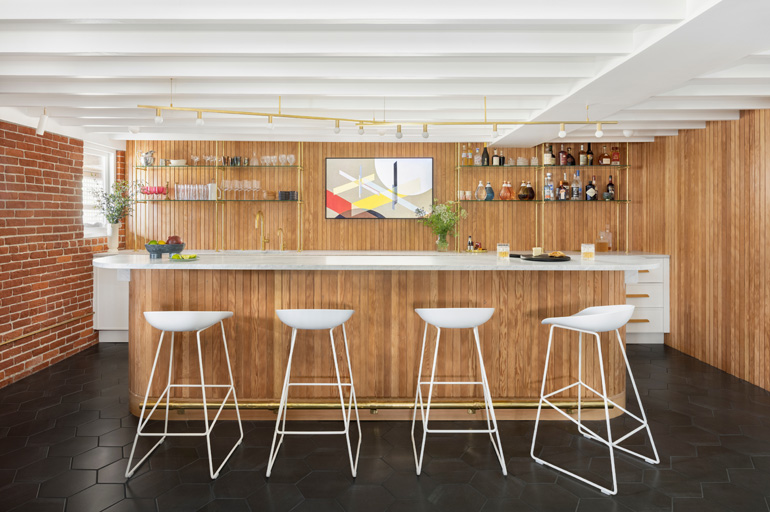
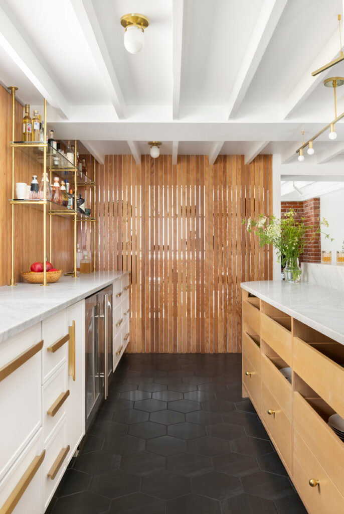
The first space they tackled with the designer was the basement, formerly just a white-brick storage space with cement floors. They envisioned this lower level for Caldicott’s wine collection and Van Sickle’s home office.
“They are total bosses — so this space was so important,” White says.
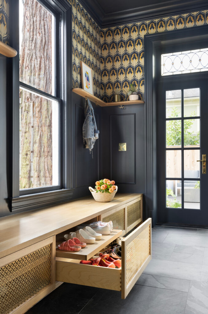
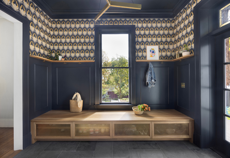
At the same time, they tackled the outdoor spaces, which benefited from a larger-than-average backyard for the area. But the project truly found its aesthetic voice with the plan for the mudroom, which was repositioned for a more accommodating entrance.
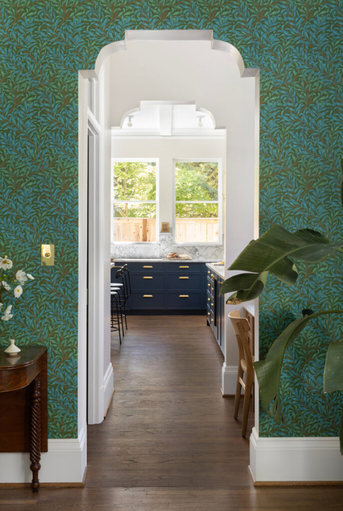
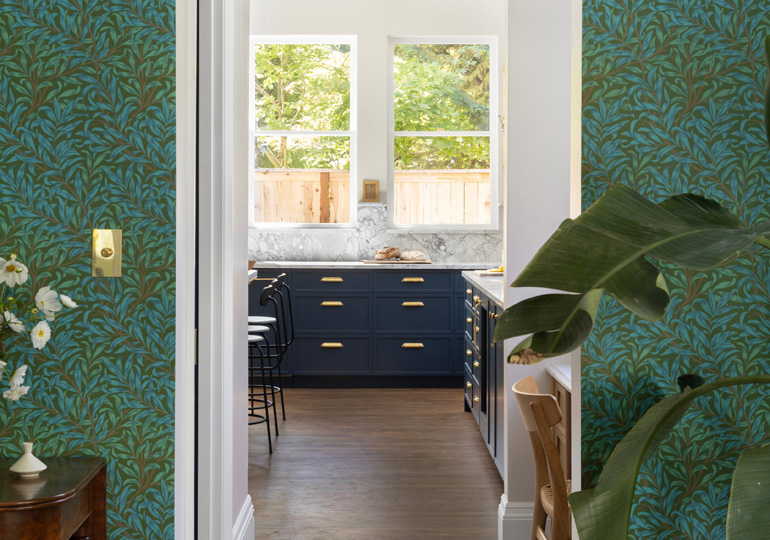
The collaborators chose local Portland maker Lonesome Pictopia’s “Solomon’s Seal” wallpaper for the mudroom and, with it, a dark gray-blue that would be used throughout the rest of the home. They loved the paper featuring the Pacific Northwest flowering native that grows in shade, which Van Sickle also grows in her garden.
“There is still a lot of light in that room, so it never feels dark,” Van Sickle says.
The pattern for the mudroom floor tiles was based on a larger-scale slate flooring from Van Sickle’s house in Ohio, which had been designed by her grandfather. Van Sickle had found photos of the slate floor and re-created the pattern in PowerPoint, and then a tiler painstakingly cut every tile and laid it to match the design.
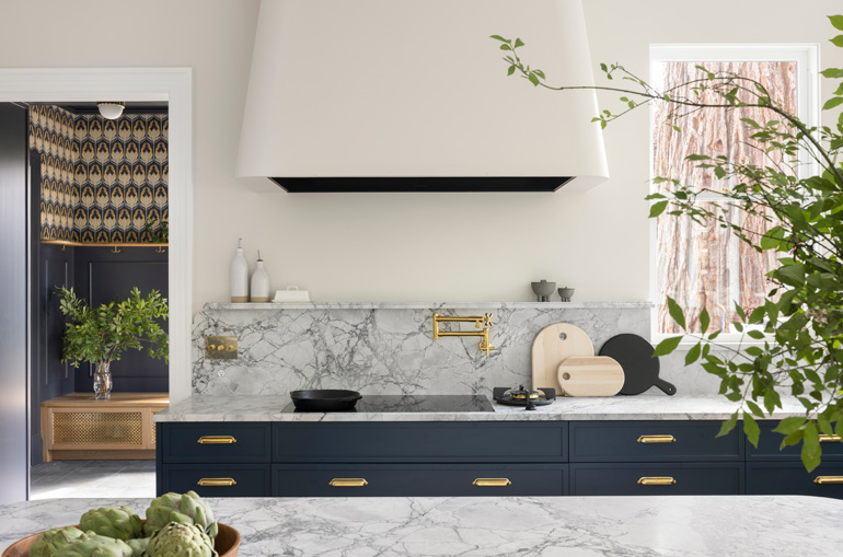
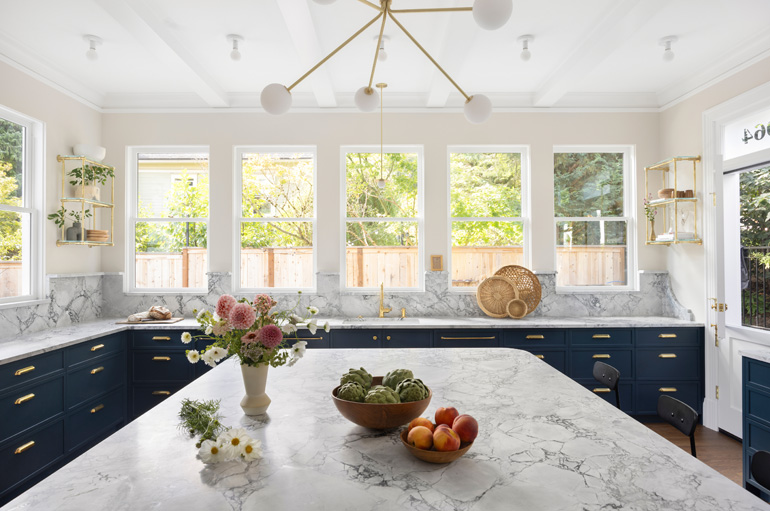
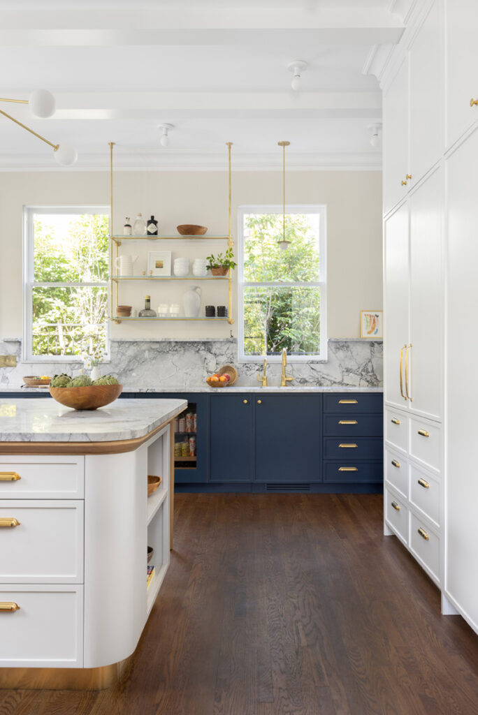
The family moved out of the home temporarily for the next part of the project: the home’s kitchen, which traded space with a formal dining room. White added a large-scale island with a brass toe kick. There, Caldicott cooks dinner most days and the entire family bakes on the weekends.
“Everyone is always in the kitchen,” Van Sickle says. “We shrunk the size a bit from what we had originally planned to make it fit one slab.”
White worked a similar dark blue-gray into the kitchen on the lower cabinets, grounding the space while making the full upper cabinets feel less heavy.
“I love a two-tone kitchen — it’s such a classic look,” says White.
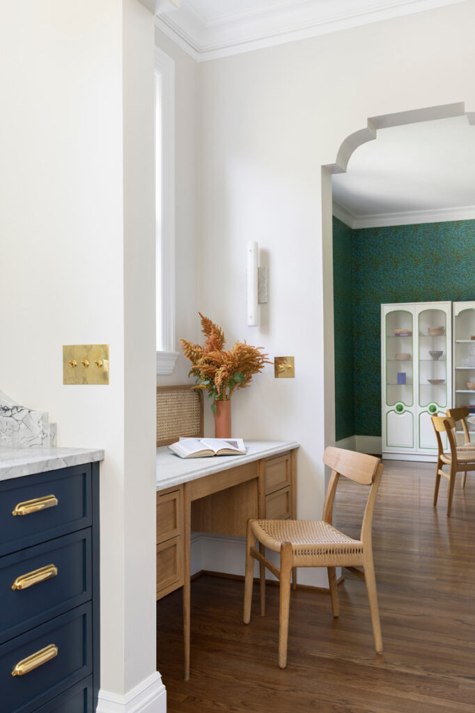
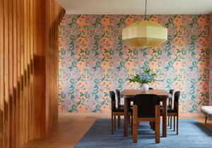
For the dining room, which the family often walks through to get to other spaces, the couple wanted something more serene than the red floral paper that wrapped the room before. So they built upon the blue and green theme with a wallpaper that would have been around at the time the house was built, from an original William Morris collection. It was just the right restrained use of saturated color to set the tone for the space.
“We weren’t totally sure we would like having a separate dining room,” says Van Sickle. “But it’s been nice to step out of the kitchen, even on weekdays, and eat together without seeing dirty dishes and other distractions.”