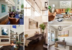

In the quest to bring color into the home, going all in on a single bold option yields great results. These projects by Oregon designers and architects show just how much thought exists behind single color choices.
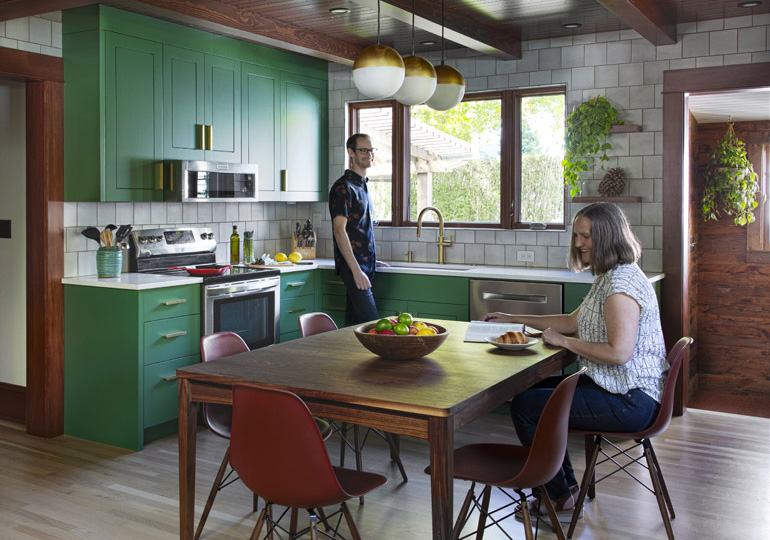
GREEN
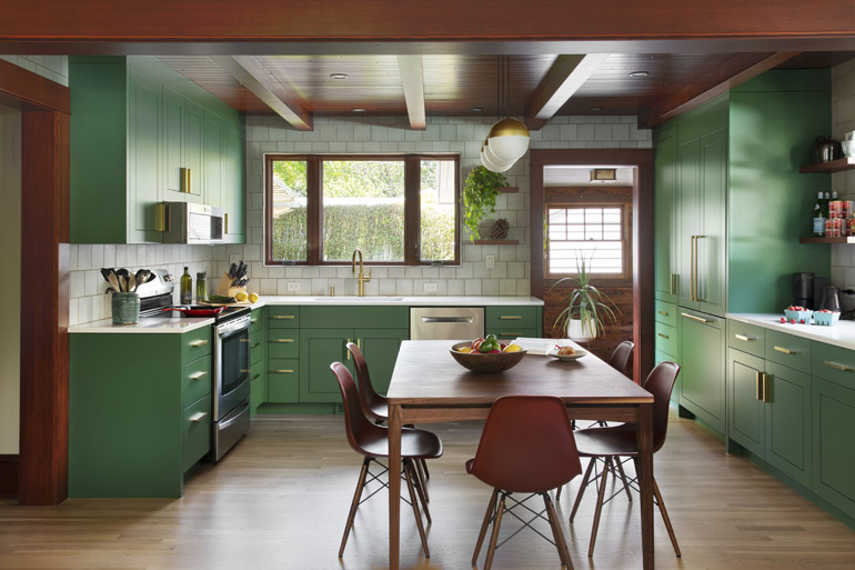
Howells Architecture | howellsarc.com
When Michael Howells was a kid growing up in the United Kingdom three decades ago, there weren’t any all-white kitchens and baths. “I never liked it and still don’t,” says the Portland architect and designer. “I call it ‘drained of color,’” Howells says. “It’s such a missed opportunity. In the art that I love—Howard Hodgkin, Joan Mitchell, Kimber Smith—color is everything.”
Howells recently applied his painterly approach to color to the kitchen of a 1923 bungalow in the Overlook neighborhood. He considered the question of color early in the project, conceived for a landscape designer and nature lover.
Howells always takes a two-pronged approach to finding the right hue: working with the native architecture of the house and feeling out what the clients might respond to. Here, he thought a lot about woodsy, cozy homes and cabins, deciding on Benjamin Moore “Balsam,” what he calls a bold, “British Racing” version of green that would give good contrast to the natural-wood elements.
“It’s much darker than I would normally recommend,” Howells says. “The bright crisp green really works well with the darker-wood elements—it gives it a little kick of modernity but plays well with tradition.”
Color should never be arbitrary, Howells says. The architect does ample detective work once he’s gotten to know his clients and presents limited options when he has found a few great choices.
Color or not? That’s never a question for Howells, who is known for his considered approach to the rainbow. “I think something has got to hold some color,” Howells says. “The Pacific Northwest reliably offers us gray outside—inside, we get to choose!”
BLUE
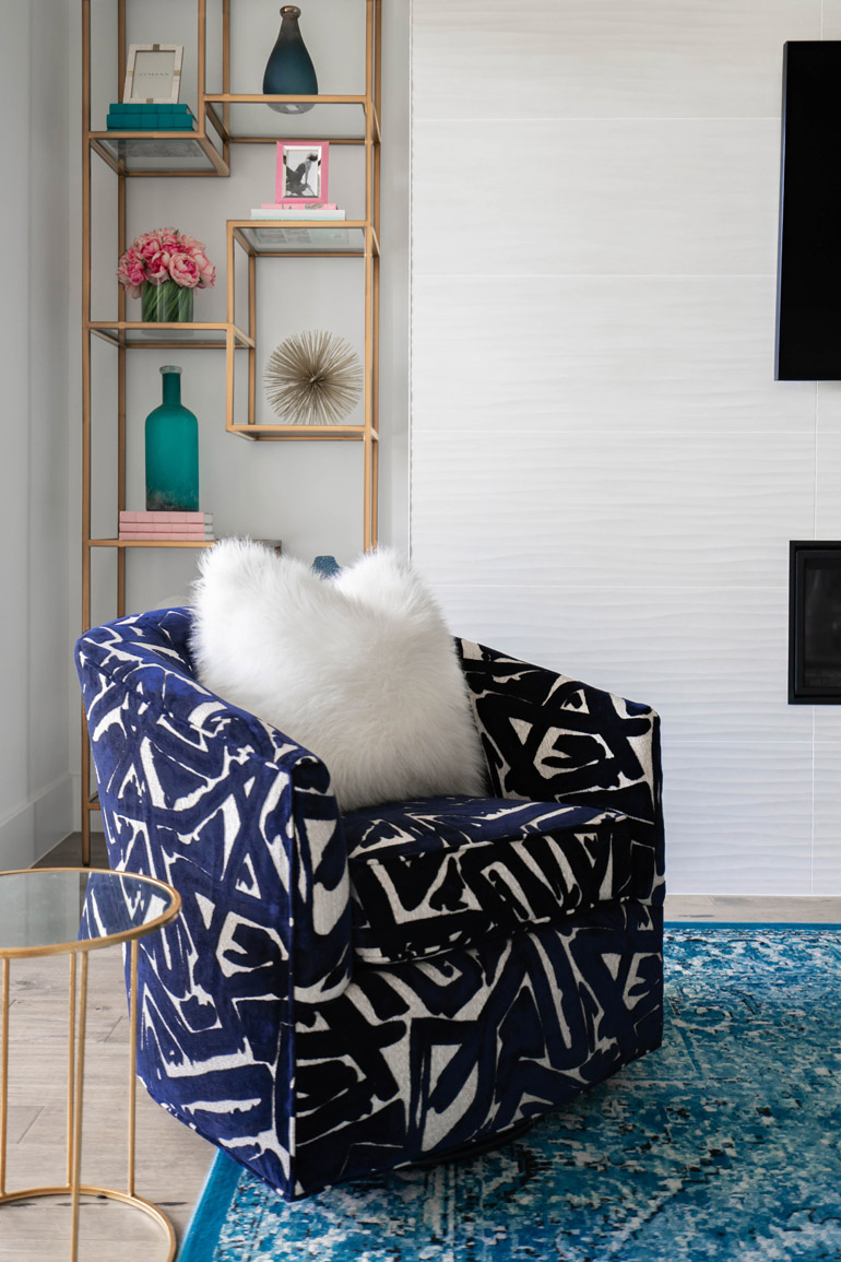
Kevin Twitty | kevintwitty.com
“People are often afraid to stray from neutral-filled images of clean and colorless interiors that flood the internet,” says Kevin Twitty, a Portland-based interior designer known for his attention to detail, globally inspired design approach and classic, timeless designs.
“I think about color right away,” says Twitty. “I want to give my clients the confidence to feel excited about showing themselves through color.”
For this urban-living three-story for a newly divorced woman—the fourth project he has done with this particular client—Twitty landed on various types of blue, a nod to her love of the sky and crystal-clear waters of a tropical vacation.
“It gives the rooms a playful sense of femininity,” Twitty says.
Twitty’s approach is to treat color like a friend and to be fearless about sprinkling colors throughout a design. Not all of his projects are this bold (often clients are only comfortable with their pillows and art having color), but he prefers to challenge clients to step outside of their boxes and take a chance they will love.
“This space feels like one big and bright smile,” Twitty says.
PURPLE
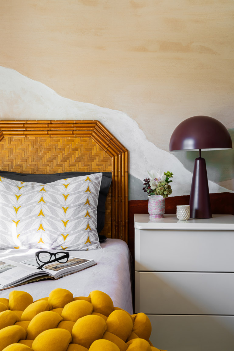
Garrison Hullinger | studiogarrison.com
Some colors of the rainbow require special consideration, like purple—a color that can dramatically transform spaces when used by the right hands.
Enter Garrison Hullinger of Studio Garrison. The Portland-based designer knew that he wanted a rich tone that wasn’t black or brown for a guest bedroom for this 1970s Palm Desert condo at the Palm Desert Tennis Club.
That’s when purple presented itself.
“It’s a color that’s brilliant on its own yet carries a sense of depth and sophistication,” Hullinger says. “It became the perfect base for the mural, which inspired other choices for this project.”
Garrison found inspiration for the mural in a late-night, eBay deep dive of 1980s abstract paintings. Jennifer Warren of Five Star Faux Finishes custom-blended the grapey-purple shade with Sherwin Williams. The bold purple lamp—it came by luck.
Purple isn’t one of Hullinger’s go-to colors.
“It feels a bit like cheetah print as a stair runner—something novel but not particularly fresh or timeless,” Hullinger says.
But powder rooms and guest rooms are the perfect places to let your inner “color-voyant” shine, he says.
“The key is intention,” Hullinger says. “Be playful and bold—these spaces are meant to surprise and delight.”
PINK
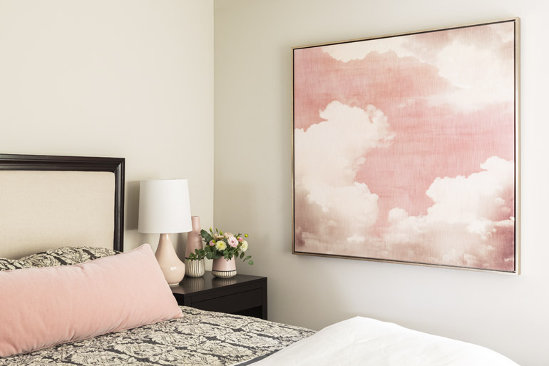
Amy Troute | amytroute.com
Color can add specific energy to a room—even when it doesn’t exist anywhere else in the house. Portland interior designer Amy Troute explored this idea for the guest room in a top-to-bottom custom build in Sylvan Heights.
“They’re young, fun and always open to creative new ideas,” says Troute of these repeat clients.
One of the owners was especially excited about adding a feminine pink, since she is the only woman in the house. The particular pink they chose came from a hue in the cloudy artwork that inspired the room.
“Spaces we design are often inspired by art, fabric or a favorite piece of furniture,” Troute says. “This cloudy pink piece just had to find a place in the home, so we built the guest room around it.”
Troute’s clients, she says, are very into color and loved the warm, ethereal mood the piece evokes. For the rest—a candy-pink velvet lumbar pillow, unique ceramic pieces bedside—Troute worked with more restrained versions of the color, just enough so that the painting feels at home in the space.
“The right pink can transform the light in a space and make it warm, calming and pretty,” Troute says. “Who doesn’t want to feel pretty?”
Color, Troute says, is everything in her work.
“It’s an ideal place to start,” she says. “When used effectively, it brings an effortless balance and flow to a space.”
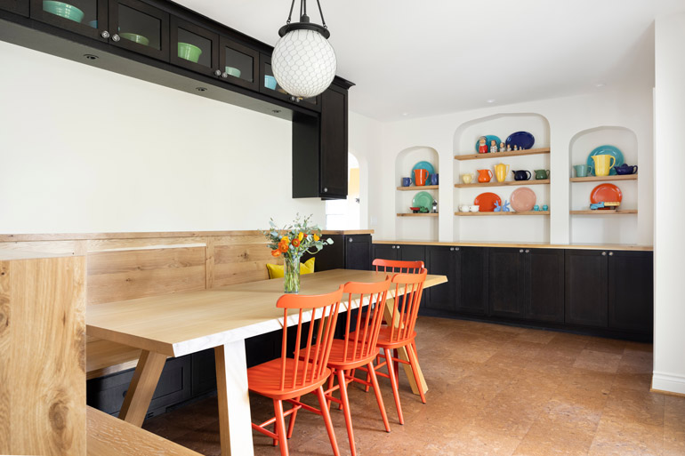
ORANGE
Adapt Interior Design | adaptinteriordesign.com
Bold color was a late addition for this kitchen by Hannah Hacker of Adapt Design, a Portland-based firm known for its modern interiors and clever approach to color.
The project, a Spanish Colonial Revival in the Southwest Hills, comprised a major kitchen remodel, a mudroom, a primary suite and a kid’s bathroom. Like much of Hacker’s work, it made great use of traditional or historic details working alongside modern touches, including striking orange on the chairs in the family dining area by Design Within Reach.
“We designed the kitchen to fit with the home but to provide a neutral backdrop for the homeowner’s colorful pottery,” Hacker says. “Once we unpacked the pottery and displayed it, the space really changed, and we went looking for those brightly colored chairs.”
Orange, Hacker says, isn’t everyone’s favorite, but it really brought in the bright energy necessary to enliven the very lively, active family’s space.
“People have such strong feelings about orange—positive and negative,” Hacker says. “I personally love it, but I would never try to talk someone into orange if they weren’t excited about it.”
Color in general—it’s a huge part of the designer’s process. She often appears as a way to highlight specific areas or materials once the foundation for a room has been laid.
“Color is a great way to make a space unique and personalized for a homeowner,” Hacker says.
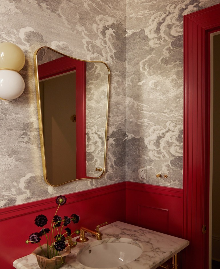
RED
Bright Designlab | brightdesignlab.com
Alissa Pulcrano tested 66 different reds in a powder room she designed for a couple with a four-story Victorian in Portland’s Nob Hill neighborhood. Her clients were ready to go all in on a moody, maximalist, gothic-inspired vision.
“Sometimes you just know when it feels right,” says Pulcrano, founder and principal designer at Bright Designlab. “This one had just the right shade of vamp.”
The clients had come to the designer with the classic Cole & Son “Nuvolette” wallpaper and a desire to pair it with a bold red, which Pulcrano and her team found in Benjamin Moore’s “Greenhow Vermillion” for the wainscotting and Sherwin Williams, “Crabby Apple” for the trim. They also went with red for the kitchen, though in that case, they chose a deeper burgundy.
Bright Designlab often starts with clients’ existing artwork and furniture in the pre-design phase, which helps guide color selections. “Playful, sophisticated, strategic, complementary, balance and intuitive come to mind,” Pulcrano says.