
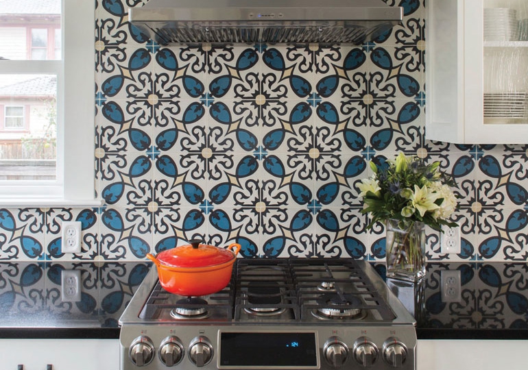
Laura Taylor brought a sample of the teal, white, cream and black Grenada tile she wanted in her kitchen to her first meeting with Mairi Kidd, a designer with Kidd Panoscha Architecture & Design. A bold choice with an eclectic, Mediterranean vibe, the pattern was the first indication that this project would be different for everyone involved.
“Tile and pattern and just fun,” said Taylor, a professor of economics at a university in Oregon. “It just catches your eye in a way that plain walls don’t.”
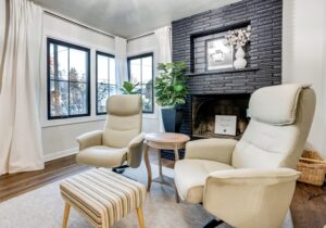
Patterns are like this: They grab you and don’t let you go. In fact, pattern can truly save the day for homeowners who are sinking deep roots into a property and are looking for a way to develop their interests. This was definitely true for Taylor and her husband, Eric O’Connor, a software engineer, who undertook a giant renovation of their 1910 foursquare home in the Buckman neighborhood of Portland. After 10 years in the home, the family had decided to address its long-term needs for space and sustainability by adding a master suite and installing a 4.35 kW/15 rooftop solar-panel system. But beyond functionality, they wanted to have fun. For Taylor, an aficionado of pattern and tile, that meant making considered choices while incorporating pattern into every room.
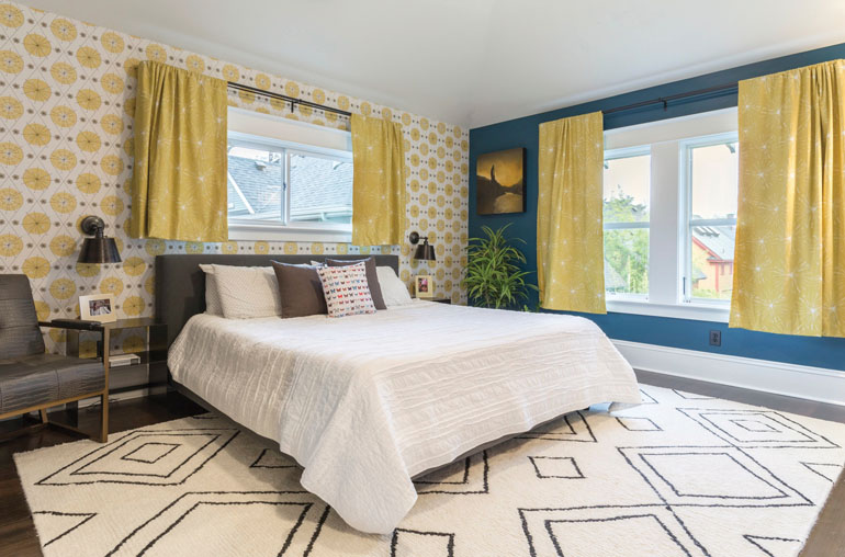
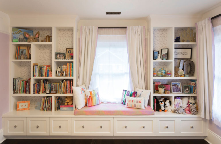
“The clients chose the black-and-white abstract flower patterns in the wallpaper and curtains to temper the bold blue walls, and the rug and bedspread to provide complementary texture.” –Mairi Kidd
Pattern is one of those design elements people can be scared to incorporate. Will it age well? Will I get sick of it? But the right patterns elevate a space and create visual interest like nothing else. Working with Taylor, Kidd worked in pattern wherever she could—in the kitchen, in daughter Violet’s bedroom, in the master bedroom and bath. In each of the settings, pattern plays a different role. Sometimes it is an eye-catching backdrop, a strong visual statement, a soothing scene setter or even a subtle nod to a sense of imagination. Using all patterns at once has never appealed to Kidd, a designer who tends to pick one statement and make other choices around it.
“Pattern can be that vital spark to the whole process, or it can be something you add in along the way,” Kidd said. “There is no one way to work with pattern.”
For Taylor, every surface and material was an opportunity for play. She spent months considering options, ordering and reordering samples, finding custom solutions to problems of color, going down rabbit holes for reproduction ceiling tins, searching for just the right sweet and light wallpaper for her daughter’s bookcase.
“At some point, you just have to make a decision,” Taylor said. “You could really do this forever.”
Play Nice
How to get patterns to get along.
You can always choose one pattern and flat color and make it work, but why not have a little fun and mix them up a bit? Remember that pattern helps determine the overall vibe of a room and can be activating for the senses. Be intentional and it’s hard to go wrong. Try these different approaches as you test and refine your own style of pattern play.
Different scales
The classic decorating principle of one large print, one medium size and one small, tight print is an easy one to incorporate. Balance is key in every space.
Similar intensity
Pastels work well with other pastels, jewel tones get along great, polka dots and stripes are a lovable pair. You can pick different patterns with the same color or intensity of color.
Inverted palette
Black-with-white pattern? Pair it with a white-with-black pattern. Patterns where the colors mirror each other connect visually.
Strange neutrals
Used liberally and creatively, some patterns can act as a neutral. Think ’90s animal print, ’80s preppy stripes — even a subtle chintz can fade into the background and make everything else pop.
Mix type
If patterns overwhelm, or you favor the serenity of a neutral space, you can always work in pattern in a neutral palette by mixing the type of pattern — say, paisley with plaid, stripe or ikat.
Create barriers
Too many patterns next to each other can send any occupant into a tizzy. Break them up with textured, solid color or neutrals to give the eye a place to rest.
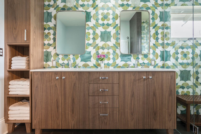
Nature-inspired curves of Ann Sacks Beau Monde Glass Chrysanthemum balances the straight lines of the cabinets in the master bath.
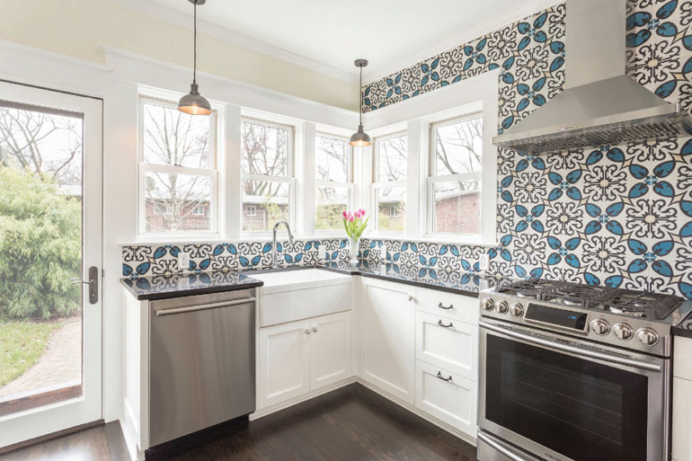
Tile in the kitchen acts as a bold focal statement, tying together the entire room and adding a unique perspective to the space.