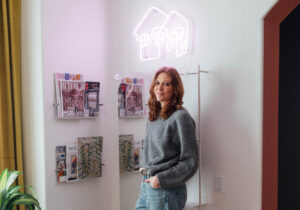

The disability advocate and master of the palette understands color is personal.
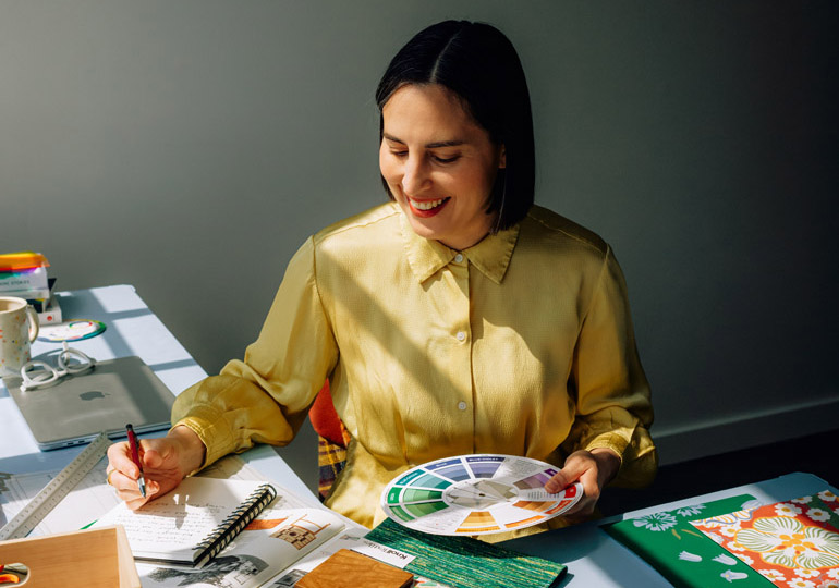
Before she began offering interior design and color consulting, Brandi Katherine Herrera was already a multidisciplinary artist—exploring the relationships between color, space and text, her work landing in the permanent collections of the Seattle Art Museum, Yale University, Reed College and UCLA. “My background allows me to see and interpret things in ways that are a little less conventional or run of the mill,” Herrera says. “I like to take risks, and be bold.” These days Herrera works with clients to incorporate more color into their lives—especially in their homes’ interiors and exteriors. We spoke with her about her approach.
OH: What’s your relationship to color and how has it developed?
Herrera: My earliest memories as a child are highly saturated with color, and I spent a lot of time as a kid and teen trying to make my surroundings as colorful as possible. My parents had this rule that I could paint my bedroom whatever color(s) I wanted, as long as I did it myself. So I did! To this day, no amount of color scares me or turns me off. I approach everything I do in life through this lens—whether it’s the clothes and accessories I put on my body, the art I make in my personal practice, or the spaces I create for myself or my clients.
How has your relationship to color changed now that you have decided to become a designer and put up your shingle as a color expert?
A fine-art practice is first and foremost for yourself. Once it’s out of your hands and in the world, it doesn’t belong to you anymore. But when you’re conducting a consultation, or designing a space for a client, you very much do have someone else’s interests, needs, comfort, safety and happiness at stake. And it’s super important to me and my practice that I listen to those interests and needs carefully.
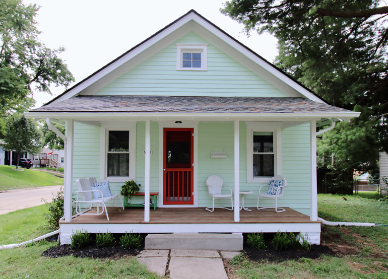
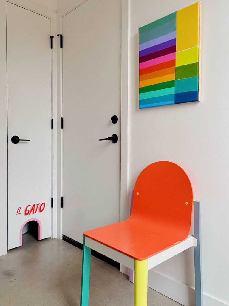
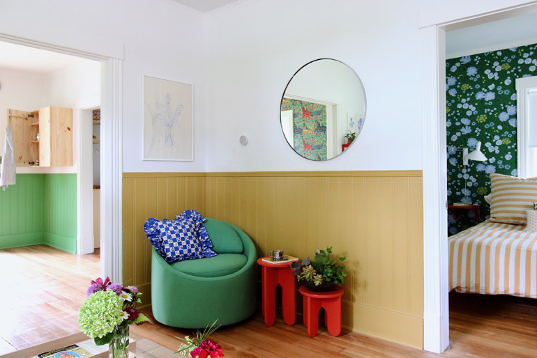
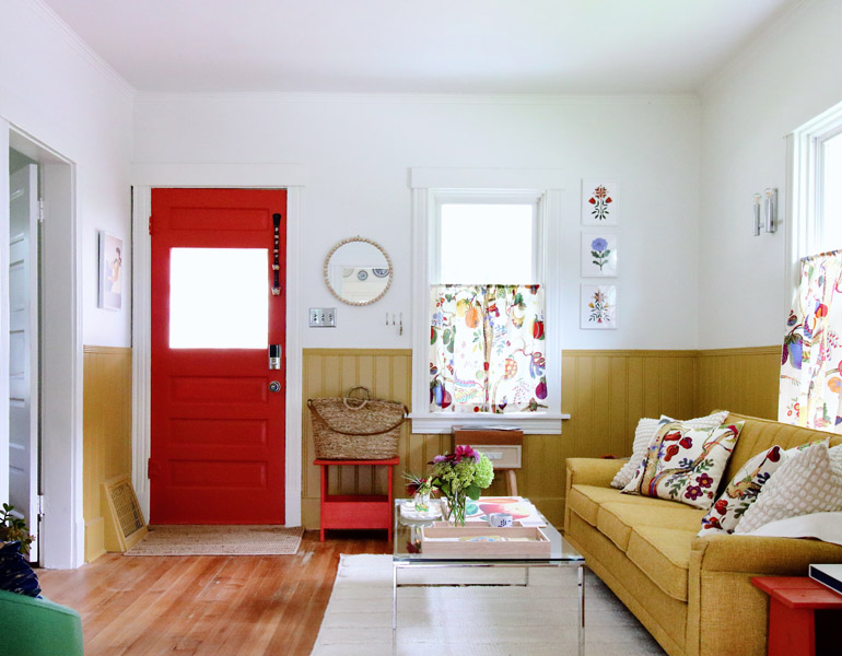
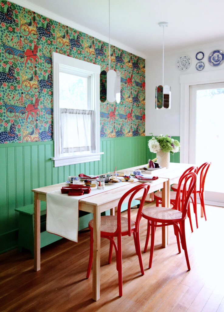
1918 Cottage
“I had full control over the color palette for this project, so I was able to weave a scheme of blue-violet plus yellow-orange, and red-orange and blue-green throughout the cottage to create a more calm, relaxing vibe in some areas and a more active, energizing atmosphere in others. ”
How do you connect a client’s personhood to colors?
Everyone sees and interprets color in unique ways, and it’s not my place to impose my own preferences onto others—especially where their personal spaces are concerned. Instead, I guide them toward the best possible solutions based on how they want to feel in a space, how they want it to function and what types of behaviors they want to elicit.
Can you share an example of how that has worked with a client?
A recent client told me she was a little taken aback to see muted pinks and earthy reds (tints and shades of red-violet) show up in the colors I was proposing for her new den renovation. She told me that whenever she thought of the color pink, she thought “Barbie girl”—it just wasn’t for her. But she told herself to keep an open mind and went to pick up color swatches to test them out. When she got them back to the house, she immediately felt like the safer, more typical options I had also presented (neutrals, blue-greens, and yellow-greens) just weren’t very interesting and felt too similar to the adjacent rooms. And when she placed the pinks and reds next to the den’s large area rug, she was surprised to see how the colors really popped.
You have a really interesting model—your Gut Checks. Tell us about them.
Most people I meet don’t require the assistance of a full-service interior design firm. They just need a little bit of courage, a nudge or a second set of skilled eyes while they’re in the process. That’s where a Gut Check comes in. It’s my service for offering real-time advice. I conduct them via text and email, and the whole process is really gratifying. I love getting to pop into someone’s life in this capacity to help them solve their most frustrating and stressful color and design challenges. Plus, Gut Checks are extremely accessible. They make it possible for me to work with a broader spectrum of people.
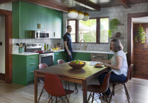
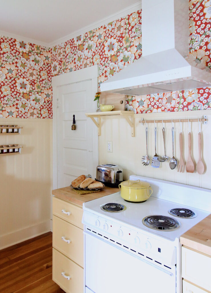
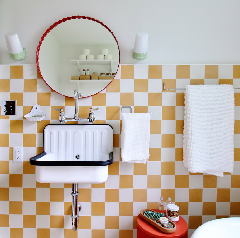
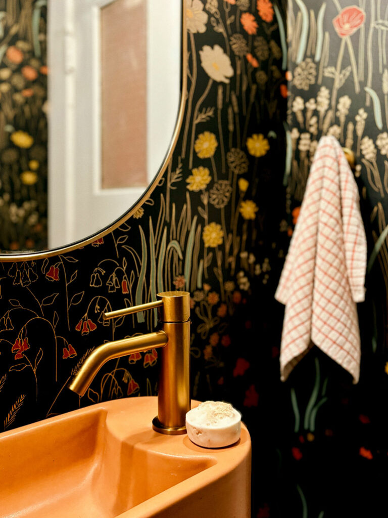
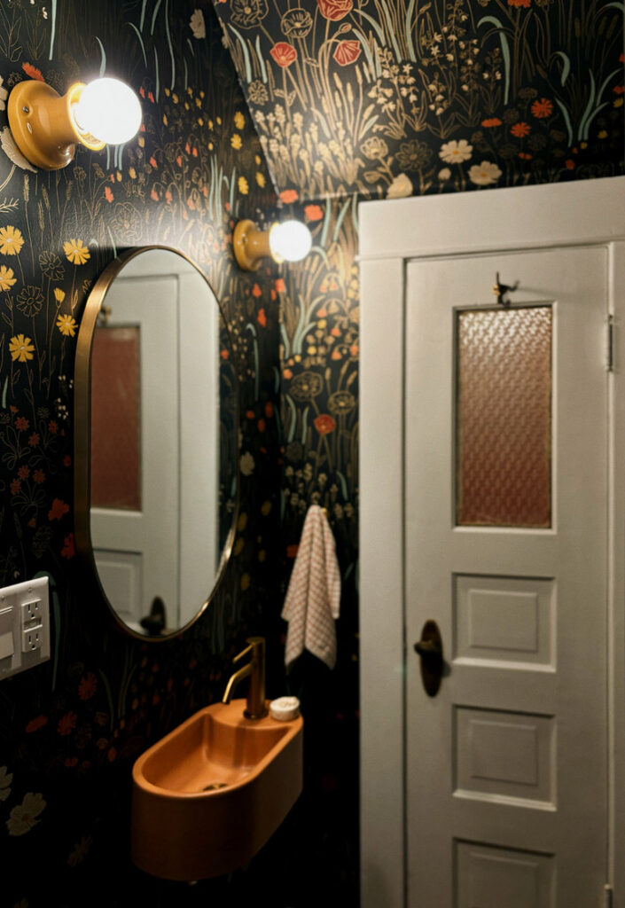
1909 Foursquare
“More restrained spaces like this are actually the most common type of project I work on—where neutrals are dominant and true hues are a bit more sparing. I think it’s most likely because neutrals have been so popular in recent years. The dominant neutrals for this kitchen and powder room remodel are gold and orange-red wood tones, bright white, and true black, with a secondary palette of earth tones—terracotta, sage and ochre. These hues show up as small accents in the kitchen but become more dominant in the powder room with its floral wallpaper, colorful concrete sink and vibrant light fixtures.”
Where can you advise on the use of color in the home?
Everywhere! Every single surface or object in an interior space has a color, whether it’s an organic material or synthetic, neutral or vibrant. This includes metal, stone, brick, tile, wood, painted, printed and laminate surfaces, as well as woven fibers/textiles—you name it. It’s a common misconception that neutrals (tints and shades of white, gray, black) somehow don’t count. But, they’re actually much trickier to work with than true hues because of their subtle undertones.
What do people need the most help with in thinking about color?
I often have clients tell me that colors they love just aren’t working in certain spaces. What they don’t realize is that it’s often because the underlying mechanisms of color theory and psychology are at play. Most people aren’t aware of the ways color physically behaves, and how it impacts our mood and emotions. That, and clients need help stepping outside of their own comfort zone.
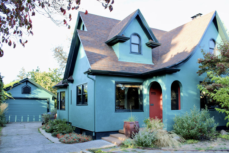
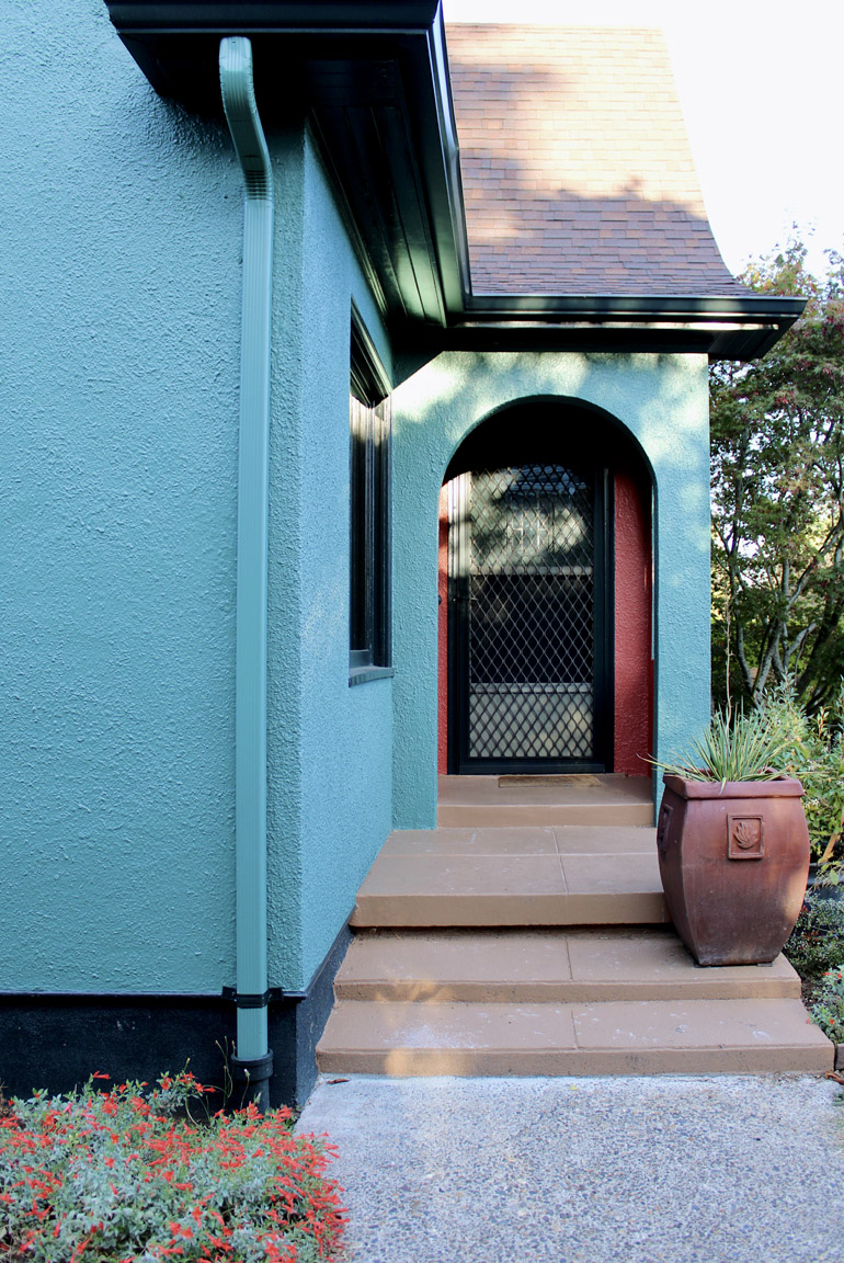
1928 Tudor
“My clients on this project are very joyful, creative people, but their home was painted the same faded yellow and brown scheme as when they bought it a decade earlier. We worked together to honor both the history of the home and its architecture, while considering the surrounding landscaping and neighboring structures, and speaking to the vibrant, fun-loving people they are.”
I really like how you are making design more accessible—more available to people with lower budgets. How do you think about accessibility, or how does that resonate with your work?
Universal Design is super important to my practice. I live and work with a chronic illness and disability, so I experience how design impacts my ability to move through the world and simply exist within a space every single day. Because of this, my practice prioritizes accessibility and the comfort, safety, and enjoyment of every person who occupies a space—regardless of their age or abilities. Function is of course priority No. 1, but aesthetics are a huge part of this as well.
On Instagram (@alivelymanner), the projects you feature are all about really poppy, inventive color. What do you want to show people on that platform about how you think about color?
Thank you so much! I really like helping people better understand how magical color really is. I think I just want to show people that color can be fun and doesn’t have to be taken so seriously. And that you don’t always have to play it so safe.
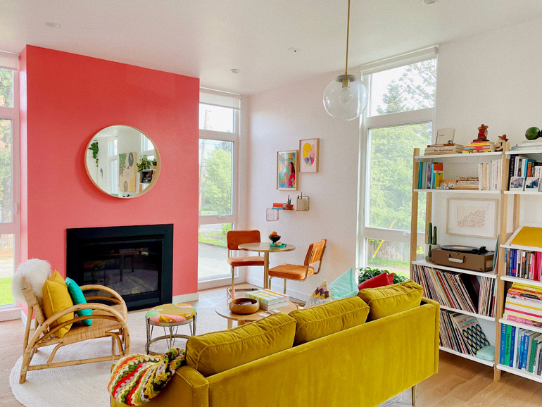
Piedmont Contemporary
“I live in a contemporary structure by Waechter Architecture. When we purchased the home, it was brand-new and very white, a blank slate. So my husband and I went about adding color by way of paint, wallpaper, furnishings and decor right away. That said, the color in our home is ever-evolving.”