Color
 |
|
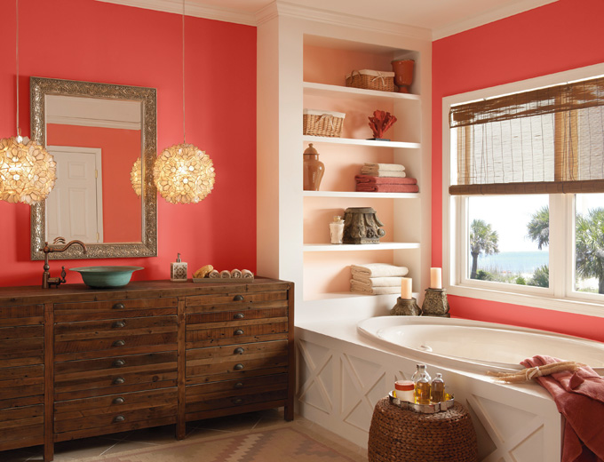
Coral color Bon Vivant by Devine Color paint offers a gentle introduction to the orange family. |
At one time, trendsetters could declare a single “it” color. The world is more complicated now. Consumers aren’t likely to universally embrace the same color any more than they’d all hunger for the same food. Fortunately, paint remains relatively low cost, so you can sample and savor the variety.
Paint manufacturers come out with several palettes of colors each season, so scores of colors are pushed to market, but for spring 2012 blue is a dominant hue. Pantone, tracker and determiner of colors used in fashion and design, offers nine poetically titled palettes and multiple shades of blue. Names such as Blue Mist, Celestial, Turkish Sea, Quarry, Grapemist and Grape Compote give some indication of the breadth and scope of the shades, from barely-there blues to saturated purplish blues. Some experts predict clear bright colors — think summer sky blue — will appeal to younger consumers, but most contemporary choices offered appear to be more complex blends such as Lexington or Rocky Hill Blues by Rodda. Pantone also declared Outrageous Orange the color of 2012. It’s doubtful the citrus shade will have broad appeal.
Paints from Portland-based Yolo offers three coordinating color groups for 2012 including a Dusk to Dawn palette of complex shades of bluish-purple that look rich and sophisticated, and Sprout, which includes a fresh almost robin’s egg blue.
Color psychology, the relatively new study of the effect of color on human emotion and behavior, suggests blue is a calming color.
Maybe that’s why, in these chaotic times, we’re feeling blue.
Pattern
 |
|
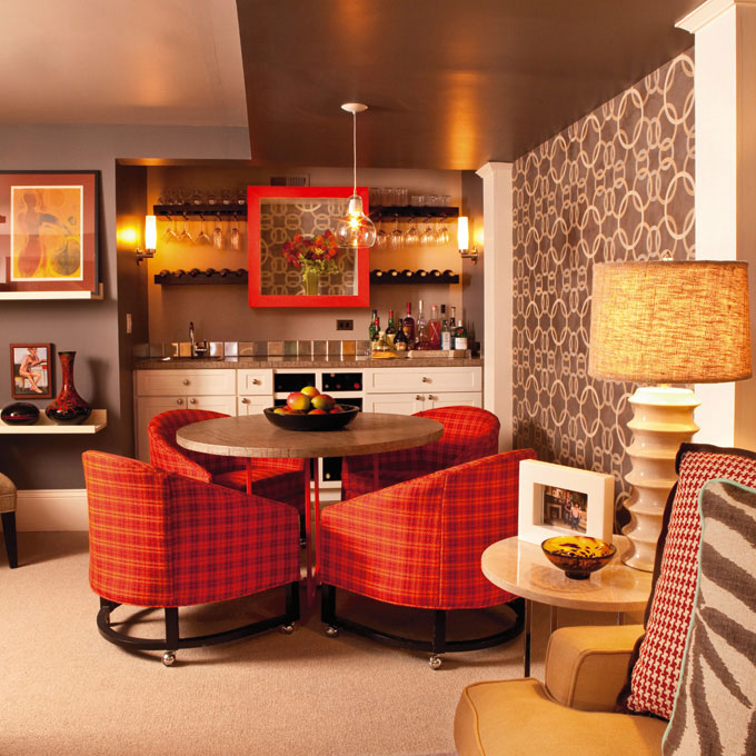
Garrision Hullinger balances plaid, circles, houndstooth and zebra prints. |
For decades décor has been in a holding pattern. Stripes, plaid, geometric and floral were in abeyance or relegated to throw pillow accents. Rare was the contemporary sofa or chair in any kind of print. And patterned wallpaper was all but forgotten for the gallons of paint.
It’s making a comeback, and not in a meek and mild manner.
“I think people are becoming more confident in the mix of patterns and color,” says designer Garrison Hullinger of Portland. “I always remind people that the first few things you bring into the room may stand out a bit, and then as you add more artwork, glassware, decorative frames — and even wall paint and wallpaper — it all starts melding.”
For one room, he covered vintage 1970s chairs with an orange plaid, then picked up a similar color in print throw pillows, and turned the wall into a work of art.
“What looks like wallpaper is actually a custom stencil our painter had manufactured, and then she painstakingly hand-trowelled on the plaster to create a dimensional effect,” he says.
A pattern mix can look playful and colorful or take on the richness of Victorian England with its layering of Indian paisley throws, tapestry and intricate wallpapers.
“A couple larger prints are a good base to start with, then add a smaller textile print,” says Hullinger. “And then throw in a plaid or stripe.”
Eclectic
 |
|
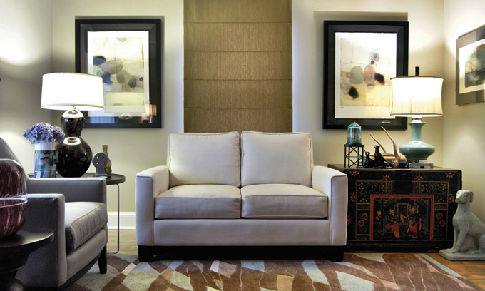
Jason Ball Interiors mixes traditional and contemporary, Asian and European furnishings. |
The 1950s matchy-matchy dream house now looks like a bit of a nightmare. Back then, the coordinated suites signaled wealth and a fresh start, a clear departure from previous years that were depressing with capital D. Now furnishing an entire room in a single shopping spree, even if you could afford to, seems downright dull to some.
“I see more combination of styles, antiques with modern pieces, mid-century with real ornate traditional pieces,” says Portland designer Jason Ball. “The collected look will come back in vogue.”
An eclectic room appears to be lovingly curated, each piece chosen for its unique strengths. Visitors might be surprised by the juxtaposition of things. That supposedly accidental aesthetic actually requires skill to pull off. It takes an artist’s eye to see the beauty and balance in disparate objects. Otherwise it can end up looking like a home for misfit furniture. Also, “It requires careful consideration of balance and proportion,” says Ball. “What I mean is the balance of styles.” Something as simple as color can unify pieces. It’s not a new idea but it’s surprisingly effective to create groupings with only color in common.
Metallic
 |
|
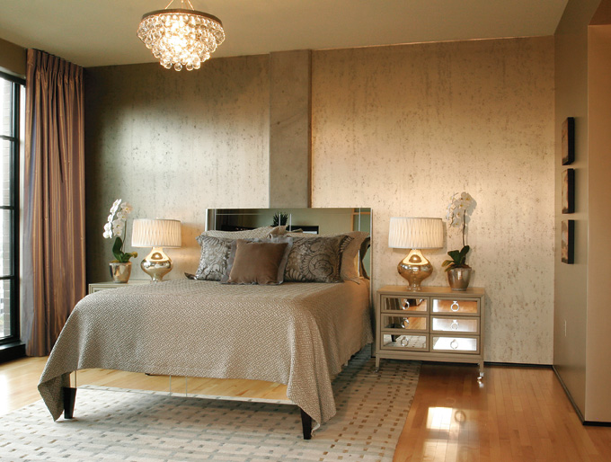
Kimberlee Jaynes Interior Designs uses burnished metals. |
Shiny metals bring to mind disco-era glitz and glitter. But burnished bronze, antique silver and aged gold have a sense of history. And old is the new new.
“Metallics started as an accessory trend,” says Portland interior designer Kimberlee Jaynes, “and now are making a broader visual statement in wall coverings, fabrics and art work.”
Jaynes created an entire condo in metallic for a client and the result is as rich as precious metal. One wall is covered with Maya Romanoff wallpaper that looks like a hybrid of concrete and metal. Other walls were sprayed with Benjamin Moore Studio paint in a three-step process resulting in a deep luster. The metallic look continues in the master bathroom with a pewter-color fabric shower curtain that feels like a couture gown. In the hallway, grass cloth with a metallic undercoat subtly reflects light like textured bronze.
“It’s easy to introduce this trend,” says Jaynes. “Reupholster your dining room chairs with burnished metallic fabrics, add metallic throw pillows to your sofa, include a metallic light fixture over the dining room table and inject the wow factor to your powder room with burnished metallic wall coverings.”
Devine Colors paint of Oregon offers Devine Dust, $9 packets of gold or silver minerals to stir into paint for a bit of metallic shine. They recommend two packets per gallon for subtle shine and up to four for more sparkle.
Trepidation about mixing metals should be put to rest. Burnished bronze, gold, silver and copper harmonize beautifully together.
Remix
 |
|
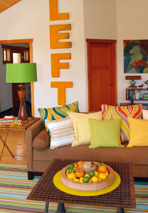
Design and tables by DeWayne Lumpkin of Home Economics of Grants Pass. |
Transforming an old door into a dining table may be all good and green. But the reason such repurposing projects have taken off may be less altruistic and more selfish: We want our spaces to be personal. In this era of global design, you can travel halfway around the world only to find yourself sitting in a house that looks as alarmingly familiar as a doppelgänger. The up-cycle, repurpose or remix trend is pushback to the anonymity of low-cost mass-produced furniture and feeds the creative impulse.
In Oregon, Rejuvenation, The Rebuilding Center, Arciform, Hammer & Hand, Schoolhouse Electric and others have worked to preserve what we have and bring new life to old structures and pieces in imaginative ways.
Home Economics of Grants Pass worked with client Laurel Walters in Phoenix, Ore., to create a space that reflects her creative work in the film and photo styling industry, and suits her life-embracing personality.
“Laurel is energetic, colorful and funny — she’s led several lives including stints working with Francis Ford Coppola,” says DeWayne Lumpkin, owner of Home Economics. Cookie cutter wouldn’t cut it. They found a hardware store metal nail bin to hold odds and ends in the living room, movie marquee letters that spell out LEFT, and constructed a coffee table top from a metal tree grate with legs from old tractor parts. An oversized bowl on top of the table was created from a wooden foundry mold.
Arciform in Portland helped a client panel a ceiling with old cabinet doors, complete with doorknobs, and also transformed a metal shipping container into a tiny, wood-paneled cabin. Portland’s City Home & Antiques is refashioning a wooden church confessional into a dressing room for a shop.
Even chain stores are responding to customers’ interest in the rare or unique by adding refurbished antiques to the mix. Williams Sonoma offers dining tables made from repurposed wood so that each has a unique time-worn patina. It’s the ultimate oxymoron — mass-produced uniqueness — and looks beautiful.
The rare reclaimed and repurposed item can be provocative buttoo much of a good thing makes a very bad room. It requires an artist’s eye and sophisticated restraint to keep from tipping into “Keep Oregon Weird” territory.
