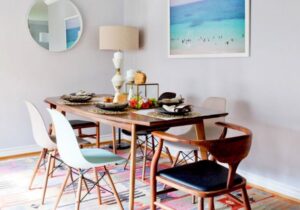

Whenever we look at trends, it is important to pay attention to where we have come from, where we are now, and where we are going in the future. Let’s take a look at each color and each neutral to determine where the overall color trends will take us in 2017.
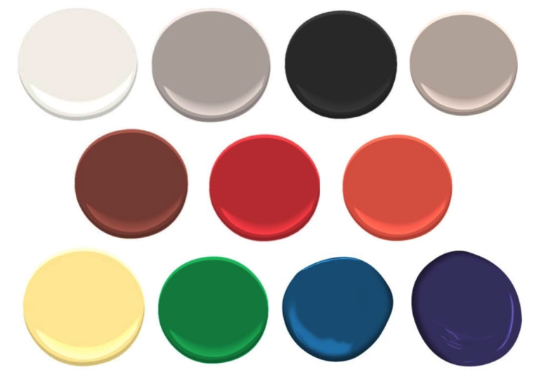
WHITE
White is our new neutral sweetheart. This year white will overtake grey as the king of the neutrals with hoodied masses finally starting to understand that we have officially beat gray to death.
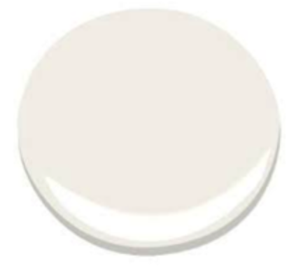
We are looking away from warm whites:
Crisp blue whites are currently on point:
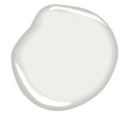
However, they will eventually fade away in favor of pink whites:
GREY
UNCLE! We get it… gray is super awesome. It’s the best color since sliced bread. This power neutral has been at the head of table for the past 5 years and is starting to get on our nerves. Gray has now officially reached its peak and will now start to fade away as whites and eventually beiges take the helm.
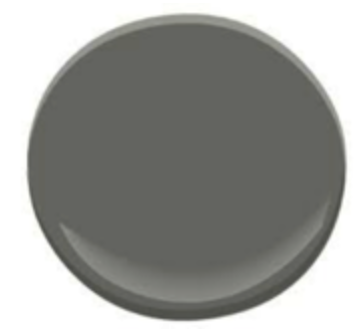
Please stop painting your rooms charcoal gray with black undertones:
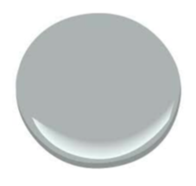
Nothing I say will stop you from using crisp grays with blue undertones right now:
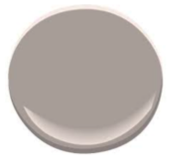
Thankfully, we will eventually favor of the pink undertones of elephant gray:
BLACK
Officially, I love black as it is the color of my heart. But I digress. Black is one of those neutrals that most people love to hate but secretly they use it all the time, as it is the champion of making all the other colors look fantastic. It will never be super popular, but everybody secretly loves a little black. Oh and by the way, all the samples below look like black, with little or no change, that’s what makes black classic; it is forever.
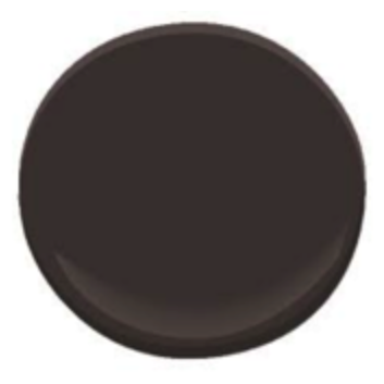
Gone are the days of warm blacks with brown undertones:
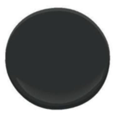
We are now simply ga-ga for cool blacks with green undertones
But wait, true blacks with blue undertones are but moments away:

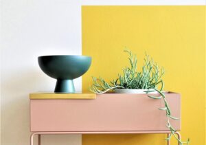
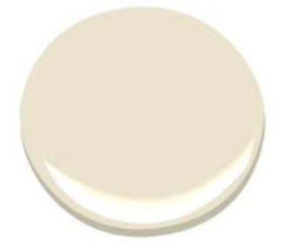
BEIGE
Poor beige, it is always being picked on for being weak; the signature color of the neutered man or the powerless woman. The trick with beige is to never underestimate its power. When used with restraint, it can be extremely effective in softening a harsh room. When left unchecked, it can suffocate a room with its weapon of choice… boredom.
Warm beiges with brown undertones are so out… yawn:
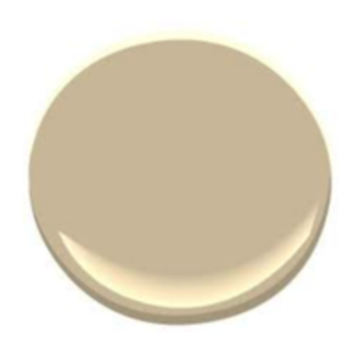
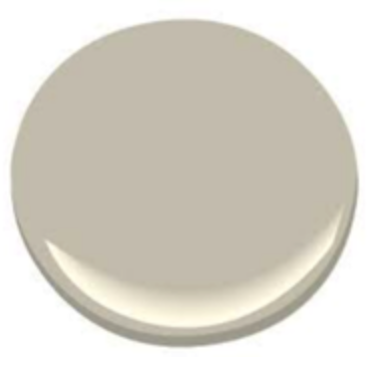
Cool beiges with grey undertones now lull us to sleep:
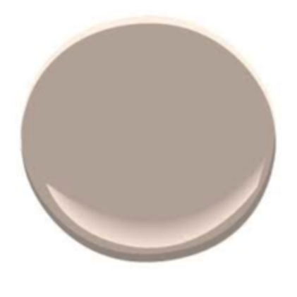
Soon we will dream in rosy beiges with pink undertones, zzzzz, zzzzz, zzzzz:
BROWN
It has been a long time since brown has been the “it girl” of the neutrals. We see brown as being our neutral work-horse, pulling its weight through the wood toned furniture found in nearly every household space. The great thing about brown is that we rarely see it in spaces even though it is ever present.
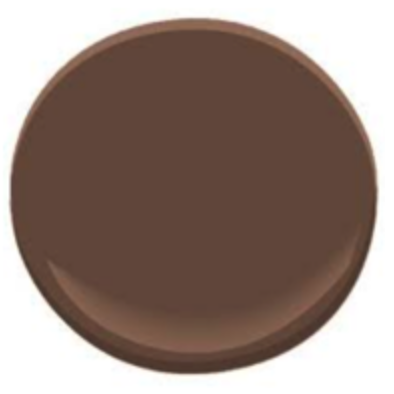
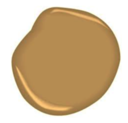
See you later warm browns with yellow undertones:
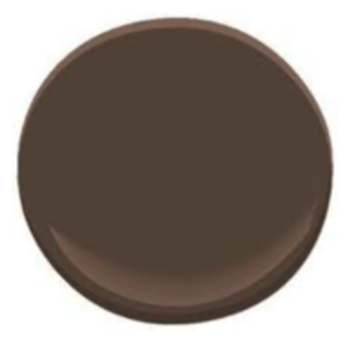
Cool browns with blue undertones are so cool they are too cool for school:
Well, hello there orange browns with pink undertones, how you doin’?:
RED
Red by far has the most impactful presence of all the colors. Small doses go a long way and should be used with great caution. Like most of our colors tones we will see a definite softening of red as we move toward the future.
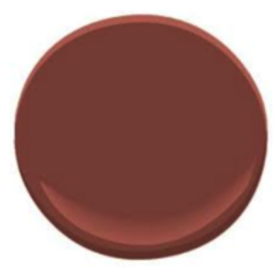
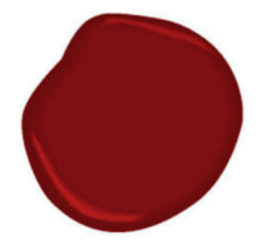
I just can’t take any more rich cranberry reds:
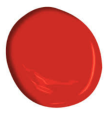
Bring me lots bright reds with orange undertones, for now:
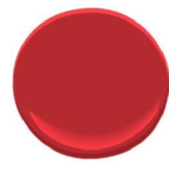
Unless, of course, you have reds with pink undertones, then I want those instead:
ORANGE
Orange is like an unruly stepchild, hard to work with but when it cooperates, you couldn’t be happier. Our love affair with orange is both constant and ever-changing. From the deep umbers to caution cone to coral, we love this color and would have a hard time turning our back on it.
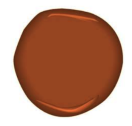
Say adios deep burnt oranges as they fade into the sunset:
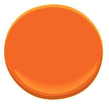
It’s time to mount up with crisp tangerine oranges:
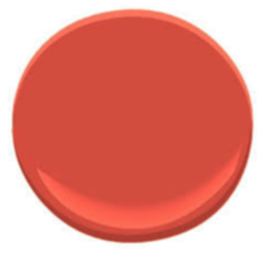
Soon you will be saying howdy to oranges with coral undertones:
YELLOW
The signature color of happiness. Gone are the days of endless fields of golden wheat, crisp is where we want our yellows today, but beware, those crisp harsh yellows of today will give way to soft yellow pastels with orange and pink undertones.
We are turning our backs deep harvest golds:
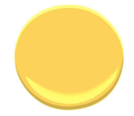
We are loving crisp sunshine:
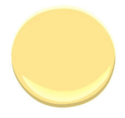
But soon our heart will long for pastels yellows with orange undertones:
GREEN
No matter the time, place or date, some form of green is always in fashion. That being said, one person can love one shade of green and completely despise another shade green in the same moment. Because green has it’s own distinct trend pattern separate from the rest of the color spectrum, we highly suggest caution with this ever-changing chameleon.
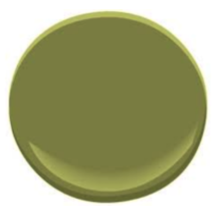
It is time to step away from deep olive greens:
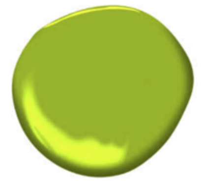
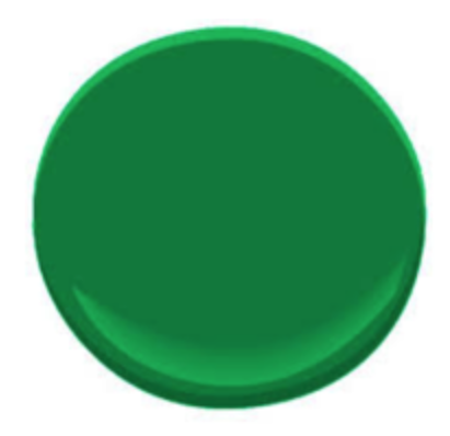
Even Pantone agrees acidic lime greens is where it’s at (at least for now):
We can hardly wait for that acid to fade away in favor of kelly greens with blue undertones:
BLUE
Has always been and will most likely always be the world’s most popular color. However, just because something is popular does not make it good, or better, it just makes it popular. Blue has about a zillion variations and there is one shade to please just about everyone. Here is where the world’s most popular color is headed.
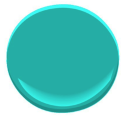
Goodbye aqua blue:
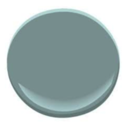
Hello greyed out slate blue:
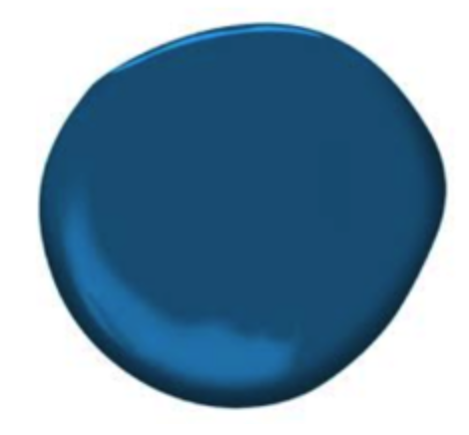
But wait until you meet strong navy blue:
PURPLE
Ok, I admit it, I’m purple-phobic. This color scares the crap out of me. It makes me question my masculinity and leaves me feeling a bit nauseated. It’s the only color with a cult following and the purple ladies are not kidding. Do not, I repeat, do not f*#% with a purple lady. If you think I am kidding, go the thepurplestore.com. The struggle is real.
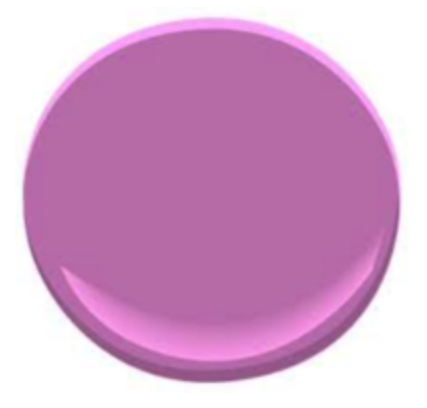
Gone are the days of lilac purples with pink undertones:
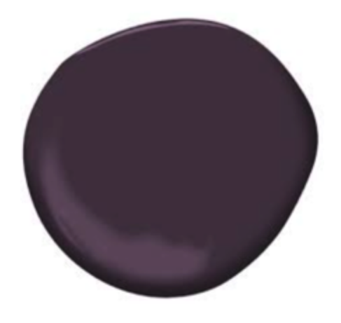
Benjamin Moore say aubergines with brown undertones is the color of the year:
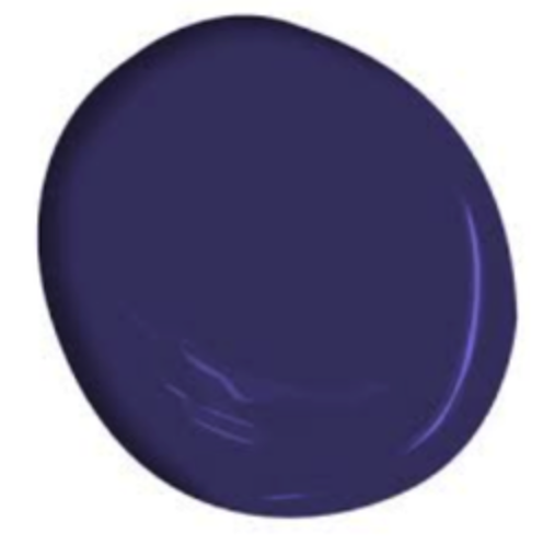
However, my contact in the purple cult tells me that deep lavenders with blue undertones are the wave of the future:
As you can tell, color is a finicky ever-changing thing. What is in today is out tomorrow, so choose wisely.
Justin M. Riordan, LEED AP is the founder of Spade and Archer Design Agency. As the creative energy behind Spade and Archer, Riordan fuses his formal training as an architect with his natural design savvy to create beautiful and authentic spaces for clients.
Prior to opening Spade and Archer in 2009, Riordan practiced interior architecture and interior construction for twelve years, bringing an esteemed skill set and diverse background to home staging. With more than a decade of hands-on project management and design experience, Riordan delivers an unmatched level of precision, expertise and service to his clients. Since founding Spade and Archer, he has personally prepared over 2,100 homes for market.