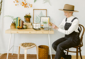
The owner of Portland gift boutique Woonwinkel gets candid about being bold at home.
Photos by Heather Keeling
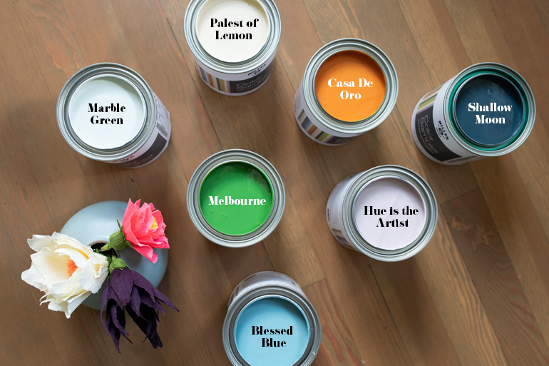
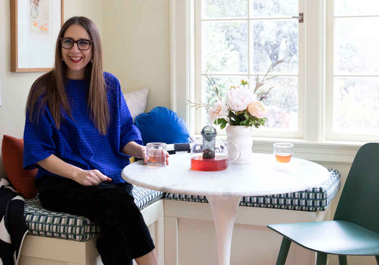
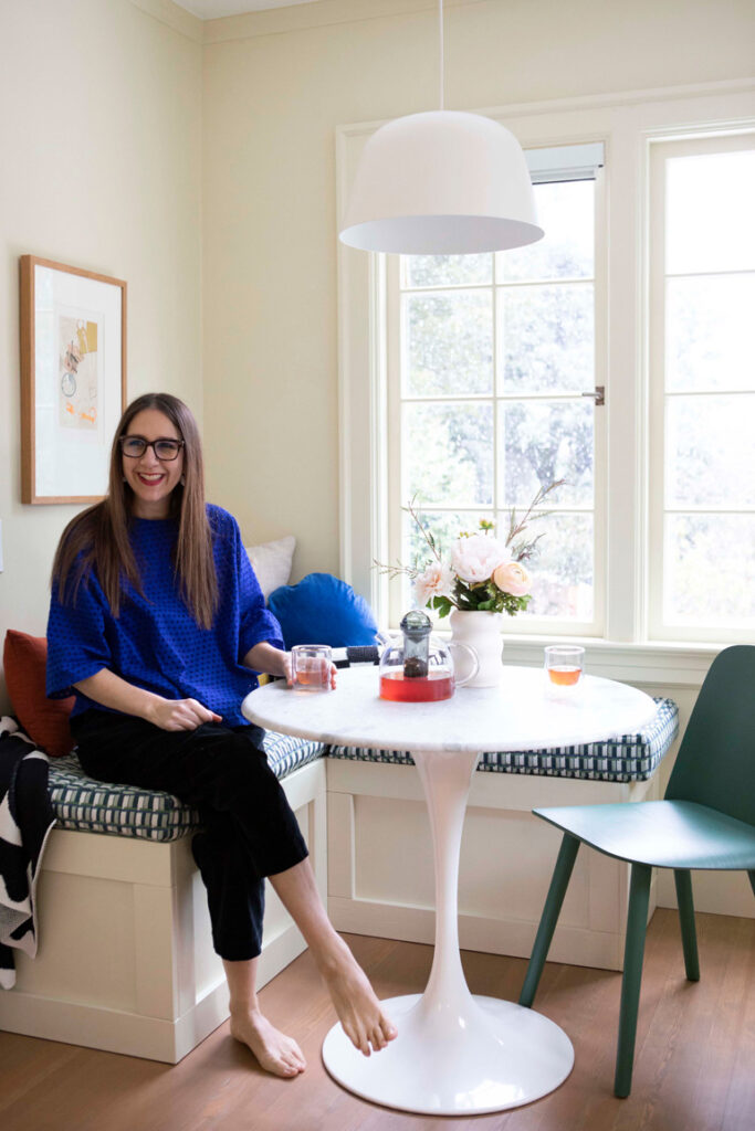
When Kristin Van Buskirk first walked through the 1920s Portland Heights Tudor she now lives in with her husband and teenage child, she knew it was enough of a blank canvas for her vibrant love of color. “We were only the third occupant, and it hadn’t been touched in 60 years,” Van Buskirk says. “It has every element you need for a creative person who wants to make themselves a house.” The former color-design director for Nike and owner of Woonwinkel, a downtown shop where you can actually shop by color category, was used to making bold color choices and connecting options to the feelings she wants to elicit in spaces. She began her painting project in the home with a small eating nook, choosing Miller Paint’s “Palest of Lemon,” a light yellow with green and red undertones, with enough gray in it that it works as a neutral.
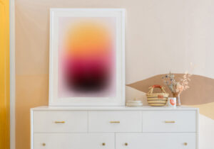
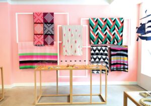
Choosing the objects that populate Woonwinkel comes easy — they are all curated to Van Buskirk’s taste, based on her two decades working professionally with color. “It’s different at home,” Van Buskirk says. “We all like color, but we have different wants and tastes, and melding it all together can be a challenge.” Van Buskirk, who started out as a fine artist, has long explored the emotional human connection to color. “Color makes you feel things,” she says, “so we can really put it to work in our homes.” So once the nook was painted, she began developing a palette that would connect the spaces to each other.
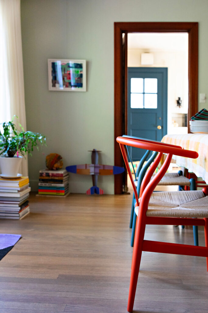
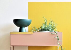
Color can be brought into the home through objects, furniture, or walls — and in Van Buskirk’s case, all three. The shop owner paid close attention to the sight lines, often sitting in one room while looking through to the other spaces. “This helps the choices feel more cohesive,” she says. “I’m always thinking about how I can pick colors that can be expressed in different ways throughout the home.” But even someone who is color confident can benefit from a second opinion, so Van Buskirk enlisted her friend Erin Albin from Appetite Interiors to fine-tune some of the colors for the other rooms.
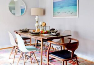
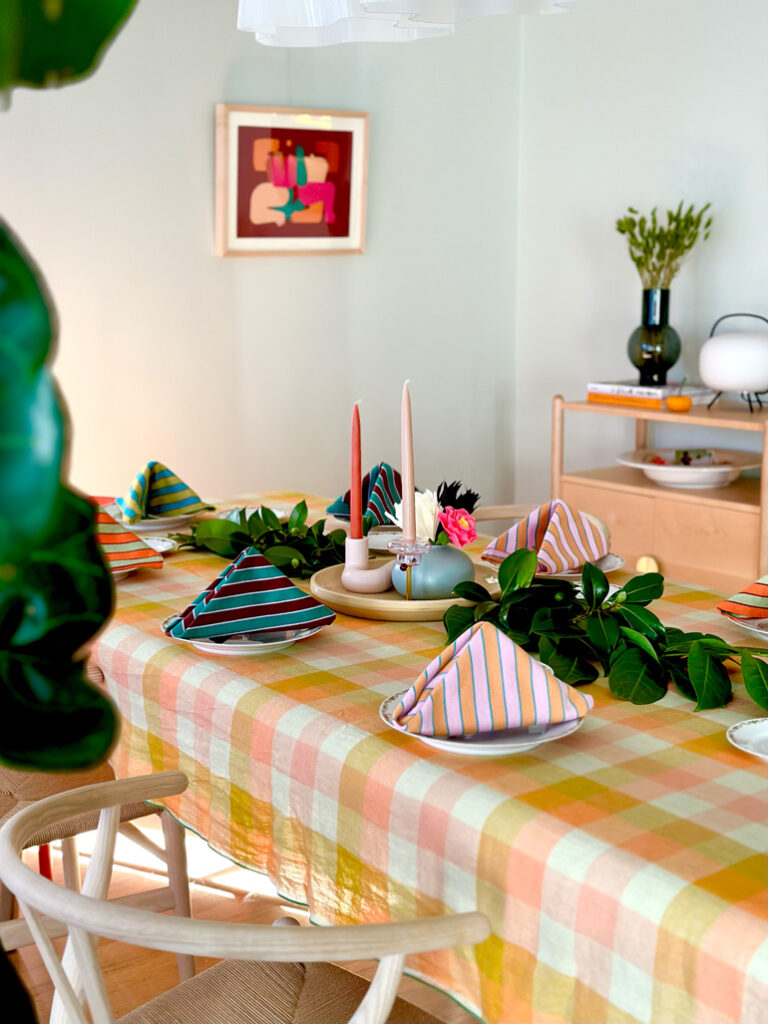
Layering colors on top of colors — such as using colorful objects in addition to color on the walls — becomes possible, Van Buskirk says, once you understand that the right colors on the wall can feel neutral. For example, in her dining room, Van Buskirk likes to set a table with bright plaid linens, which feel modern and unfussy in a room painted with Miller Paint’s “Marble Green.” “Color is about feeling,” she says. “It can give you that boost you need based on whatever you are dealing with in life.”
Van Buskirk works with many paint companies but is especially fond of local company Miller Paint’s Northwest Color Collection, which brings together a palette of muddled in-between colors suited to the region she calls home. When she tests paints at home, she uses the entire sample can to paint as much of a wall as possible so she can sense the effect of the color over time before committing. “The beauty of paint is that it’s one of the less expensive changes you can make at home and you can experiment on whatever schedule you have and based on how you are feeling,” she says.