A Portland couple’s home is a playground for the bold and the beautiful.
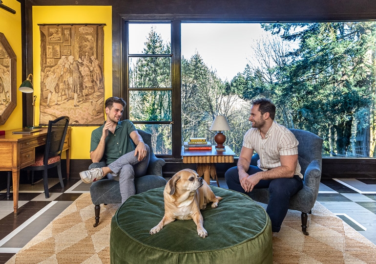
Peter Spalding’s first months as a homeowner in Portland were marked by a rotating caravan of new neighbors showing up at his door with wine, vegan dinners and sheet-pan brownies. The designer and chief brand officer of Daniel House Club had moved with his husband, Kevin Fadden, into a dilapidated and nondescript home in the Southwest Portland neighborhood of Burlingame, where they fast became the most beloved people on the street.
“The house was like a collapsed soufflé when we bought it,” Spalding says. “It had no heat when we moved in, and it had been completely misused.”
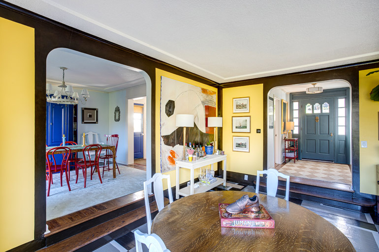
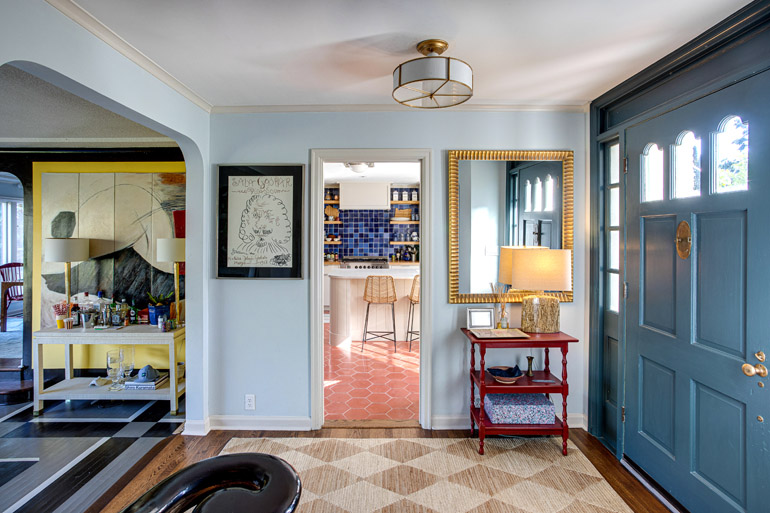
These days, the couple wakes up early on the weekends in a home dominated by the primary color palette of red, blue and yellow to dream about what new house project they are going to take on. During the workweek, Fadden is the director of consumer assortment planning at Nike while Spalding builds Daniel House Club, an innovative e-commerce platform that allows designers and their clients to collaborate more easily on projects and acquire more interesting objects for homes. Spalding started the business in 2015 with his brother, Alexander, and has seen it grow from an emerging platform to an established destination for sourcing designer products at more approachable pricing.
“Before the pandemic, people weren’t comfortable ordering things like couches on the internet,” Spalding says. “Now people want stuff and they want it in stock, and they are less reluctant to order online.”
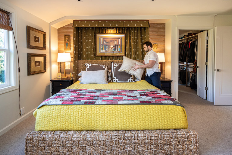
Just a few years after moving in, the couple’s home is a showcase of Spalding’s style — formed by his years working as an interior designer with New York architect Peter Pennoyer — and Fadden’s hosting impulses. Spalding tends to lead on design while Fadden loves a great hands-on project.
“Kevin is much more geared toward making sure everyone is going to have a good time,” Spalding says.
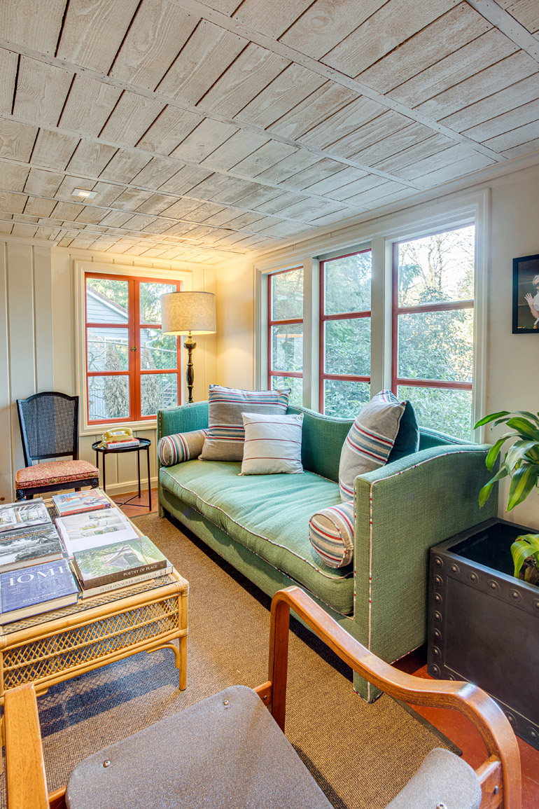
Beautiful furniture and objects abound, many of them sourced from Daniel House Club, from an Erin lamp by Mitzi in the family room to the living room’s Indochine side table by Red Egg, its natural woven jute rug and a Ming grasscloth console. Spalding’s tastes range from classical to modern, mixing objects with a personal background in with some he loves purely based on what he likes.
“I like to keep the main furniture kind of boring so I can show off the things I’ve never seen anywhere else,” Spalding says. “I don’t like the major pieces to be compelling.”
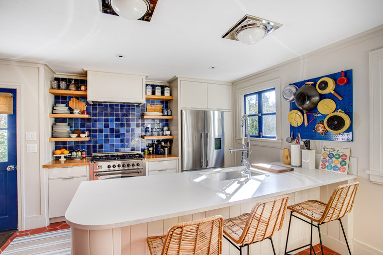
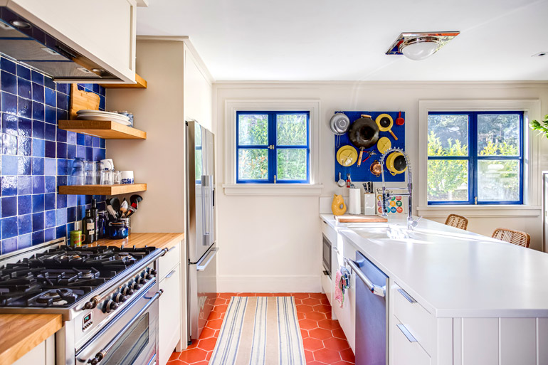
There is also color — a lot of it, artfully chosen to work with a palette of muted reds, a range of blues, bright yellows, and an accent green that leans toward olive. The effect is balanced and sophisticated with high energy while providing a backdrop for the decor.
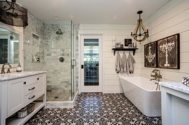
“The story behind the object is less important to me than what I like about it,” Spalding says.
Spalding sources many of his objects from vendors looking to partner with Daniel House Club, making the home something of a testing ground for possible collaborations. While he doesn’t often rotate objects in and out of the home, he will move them around every couple of months to see how they might work in clients’ spaces. Above all, he looks for objects that adhere to a basic form but that have interesting details and fantastic shapes.
“I’m opposed to the word ‘unique,’” he says. “You just don’t need to get too weird in one object for the overall to be more interesting.”
Color Take
Designer Peter Spalding on how he thinks about color
Where do you even begin with thinking about color in a home?
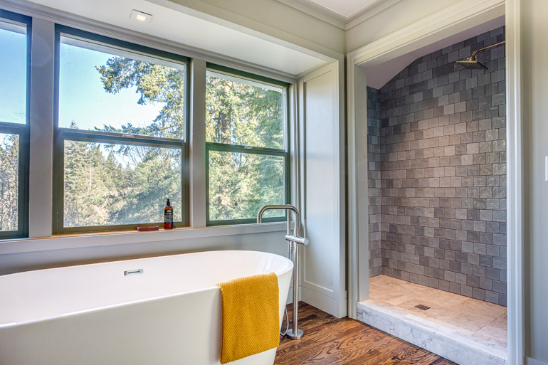
I usually start with whether I’ve seen colors work together in dress or in a fabric. Then I think: OK, we can try this in a home. One thing that I like to decide early is between cool or warm color palettes. You usually have both warm and cool colors in a palette, but usually there needs to be an underlying concept that is warm or cool.
How does light affect the colors you choose for homes in Oregon?
Light exposure is so important. Rooms that don’t have a lot of sunlight can handle more intense color. I sometimes like to put a bolder color on the framing and something more subdued on the walls. People tend to be limited in how they imagine where color can go.
Any favorites to use in Oregon homes?
I have used HC-133 (Benjamin Moore’s Yorktowne Green), like, five times. It’s a teal blue green and it looks good everywhere. Oregon has that crystal-clear sky in the summertime. Having that moody color on the wall creates a picture frame for the outside. I tried to stop using it, since I was getting bored but people just love it.
Peter Spalding
Prime Time
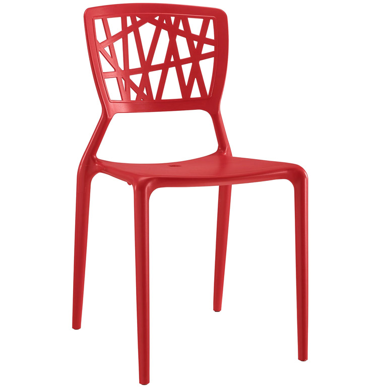
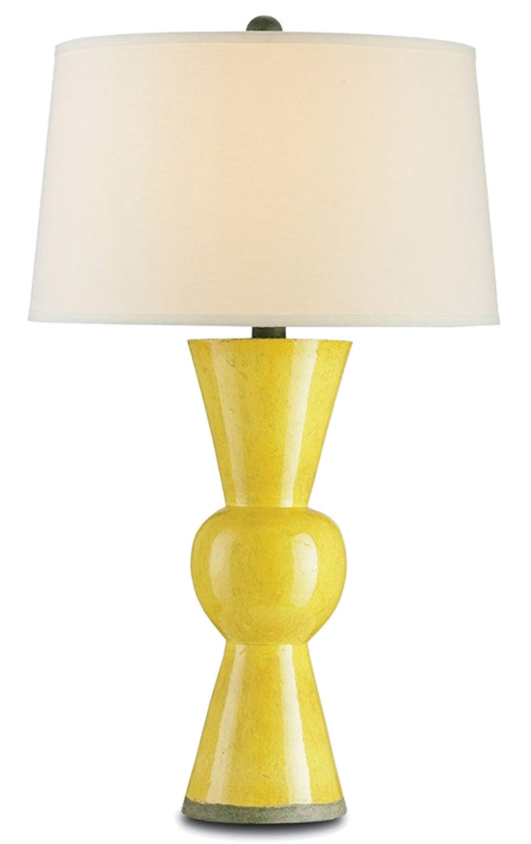
Style with primary-colored objects from Daniel House Club for big impact.
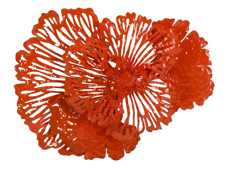
Flower Wall Art
$329
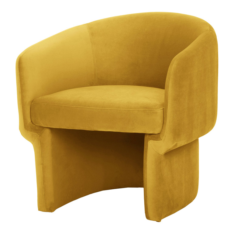
Franco Chair
$929
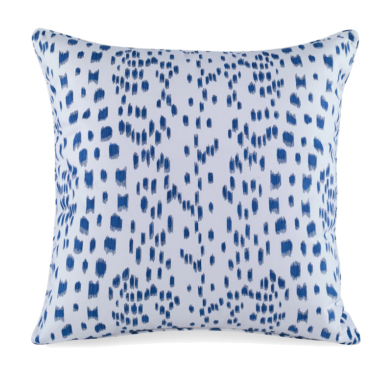
Les Touches Pillow in Blue
$195
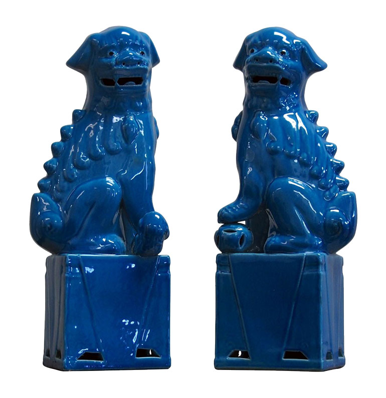
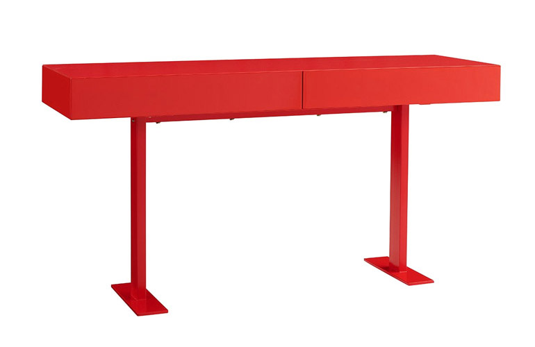
Liam Console
$1,159
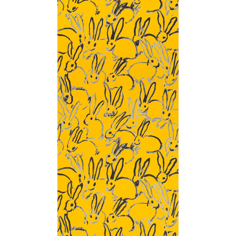
Hutch Wallpaper
$656 (2 rolls)
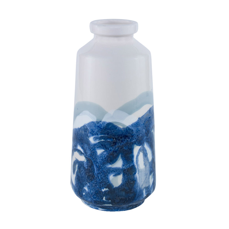
Kai Vase
$56
